The story of Tupo, my new daily logic puzzle
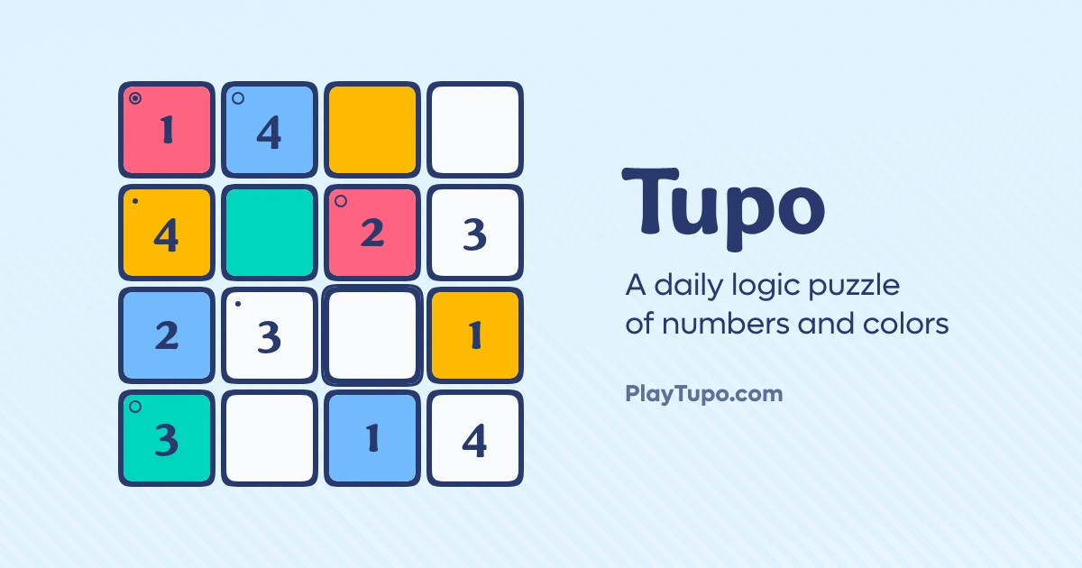
I am highly excited to share a project I’ve been working on for the last month or so. It’s called Tupo, and it’s a daily logic puzzle in the sudoku genre. (In fact, it would be fair to call Tupo a two-in-one Sudoku puzzle, although there’s slightly more to it than that.)
I already announced Tupo on socials a week or two ago, so rather than make this a (very belated) announcement post, I’ll instead take the opportunity do dig into the process behind the game, and talk about some of the decisions and behind-the-scenes events that led to its creation and release.
Let’s start, however, with what Tupo actually is.
The rules
As most of you probably already know, in a traditional sudoku puzzle, you fill the grid with digits such that every row and column contains the numbers 1–9 with no repeats.
Tupo adds a twist: you’re actually putting two things into each cell; a number and a color. (I call them “tiles” rather than “cells” in Tupo, just because of the design, but tomayto, tomahto.) The same rules apply to both; every row and column must have each number and each color exactly once.
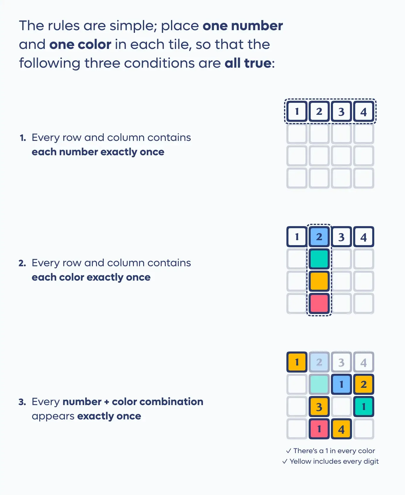
If the rules stopped there, that might be fine enough. But you’d really just be playing two overlapping yet unrelated puzzles; you could slap any color layer together with any number layer. There would be more game to play, but it wouldn’t really be much different than a one-dimensional sudoku.
That’s why Tupo has one more key rule, which is the defining piece: no combination of number and color can repeat anywhere on the board; every possible combo (red 1, blue 2, etc.) will occur exactly once somewhere on the board.
That third rule, it turns out, is the heart of the game; it’s what ties the numbers and colors together, and it creates the most interesting and challenging deductions.
Now: if you’re envisioning all of this on a regular 9×9 sudoku grid, it might seem overwhelming, and for good reason. That would be a lot to keep track of (not to mention more colors than the rainbow). That’s why Tupo shrinks the idea down to either a 4×4 or a 5×5 grid, depending on the day and difficulty level; it keeps the board digestible, and the colors down to a manageable contrasting selection.
That smaller grid size would make a traditional sudoku-like puzzle too easy, but with two interwoven layers, the smaller size makes the game approachable, yet still healthily challenging.
In my personal testing, I found the idea takes some time to get used to. It’s got a noticeable learning curve, as your brain adjusts to thinking about both layers of the puzzle at once. (It’s pretty common for new players to try completing one whole side first, then the other, and the game is purposefully designed not to work that way.) But it’s rewarding to see your completion times begin to drop when the game starts to click (at least, in my clearly unbiased opinion).
How Tupo came to be
Maybe weirdly, Tupo came from a period of pretty strong burnout in my life.
I found myself in a rut where nothing I was working on was exciting or interesting to me. Days became mostly about, well, getting through the day. I spent every evening with a TV show I didn’t care about playing in the background, as I halfheartedly played a video game I also wasn’t that interested in. (I finished 100%-ing Balatro for the second time in this time period; that’s how much I was aimlessly falling back to my defaults.)
At some point, I realized that even if many of the factors that led to my state were beyond my control, I could still control what I was doing about it. (Or at least, do a better job of it than I was at that point.)
These things are unique to everyone, of course, but for me: I’ve always had a need to make things, and burnout tends to wallop me extra hard when I’m doing too much consuming and not enough creating. There’s joy in making something, and having it be your own. There’s meaning in willing something into existence, and knowing you shaped the world in whatever tiny yet intensely personal way. I hadn’t given myself that experience in a very long time.
Sometimes—for me, at least—when you find yourself in a state of apathy, the solution is just to find something worth caring about, and go live in that world for a while. So I sat down with a vague idea in my mind, and set about prototyping.
The prototyping swamp
As you may or may not know: I’ve published a couple of game apps before (although both are word games and Tupo is the first pure logic puzzle); I first released Quina in 2020, and Hondo in 2022. So that makes it over four years since my last “release.” (I use quotes because this is the open web; unlike, say, movies or music, releasing something here is mostly just semantics.)
It hadn’t been entirely for lack of interest, or effort; I’ve tried ideas on and off over the years. I’d even gotten temporarily excited about some of them. My projects folder is littered with repos that each only had a handful of commits before being abandoned; amorphous concepts I loved in theory, then chased just long enough to realize they didn’t work very well once they collided with reality.
This is partly because up until recently, shifting directions with a prototype—or spinning up a new one entirely—had a fairly significant cost. I might have had to spent an entire evening or more wiring up an idea, and if it didn’t work like I hoped, I might have been forced to spend another entire evening changing course. It previously didn’t take much to eat up an entire week’s worth of work time.
If you know my writing at all, you know I’m not exactly an AI enthusiast. But I have to admit: LLMs have made prototyping exponentially more manageable. Now that a failed idea doesn’t mean losing a whole day of work, and a pivot has very little penalty, I was free to explore in any direction my ideas might take me.
I bring this up because my original idea for the game had virtually nothing in common with where the game eventually ended up.
At first, I wanted to combine Clues by Sam with Understand, and have some kind of logical deduction game where you had to infer the rules yourself (“rule discovery,” as the genre is sometimes called). It seemed like a cool idea in my head, but once again, my head was the only place the idea seemed to work. Nothing I tried in that vein was actually fun or interesting in practice; it was either too derivative, or too obtuse.
Before LLM assistance, that would’ve been the end of the exploration. (Actually, I probably wouldn’t have even gotten that far; making a puzzle generator alone might have been too much of a roadblock.) But thankfully, the idea didn’t have to end at the first iteration.
My next idea was a logic puzzle where a set of clues was given up front, and you used those clues to put shapes into a grid. (For example: ”no triangle is adjacent to a circle,” or “there are no stars in column B.”) Again: this sounded like it might be interesting, but in practice, it was just way too much information for a player to hold in their head at once. In order for the game to be challenging, there had to be lots of clues—but the more clues there were, the more tedious the game became. I’d basically just invented a way worse version of Clues by Sam.
At that point, though, I had a loose logic-puzzle-with-shapes generator working, and so somehow, the idea came to me: what about sudoku, but with two layers instead of one?
That’s how the basics of Tupo came to be. At first, I used shapes and colors, but I soon realized keeping one layer familiar by using numbers instead was the better move for helping new players understand the game. (Plus, this meant I could combine shapes and colors for the colorblind assist mode—which I myself prefer, by the way.)
I initially thought two-parameter Sudoku was an original idea, but I soon came to suspect I must not be the first to stumble on the concept. I was laughably correct; not only are there number + color sudoku games already in circulation (along with pretty much every other variant you could possibly imagine), but the basis of the format is called a Graeco-Latin square (or a Euler square, or a mutually orthogonal Latin square), and they’ve been around since at least the 1700s.
That’s not to say Tupo is derivative, though; its originality just isn’t in the core mechanic. Shrinking the whole board down to a smaller grid to make it approachable in a daily format, and leaning on the uniqueness rule as the unifying deduction driver, is where the game gets its distinct identity.
Once I landed on that idea, it felt like everything else clicked into place, and the rest was just building out the best version I could.
I suddenly had something I cared about. I had a game I actually wanted to play, wanted to work on, and wanted to share.
There’s something about that balance of building something for other people to enjoy, but which can also give me a much-needed creative outlet to shape for myself…it adds a value and a meaning to the project that’s hard to find elsewhere. Even if not a lot of people end up playing it, that’s ok. That’s not really the point.
Before I knew it, I had gone two full weeks without so much as touching a video game.
Was everything in my life fixed? No. But for the first time in a long time, I was excited. And actually…that kinda helped with all the other stuff, too.
Game decisions
I kept a log of decisions and changes made throughout the dev process, because I thought it might be interesting to look back and see what changes had been made. (Ok, you caught me: I’m not that organized. I had an agent comb the commit history for me.)
Candidates/pencil marks
One of the earliest surprises of the dev process was the discovery that pencil marks actually don’t help in this game. The ability to mark candidates for a given tile is such a staple in other puzzles—particularly sudoku—that it only seemed natural to include them here.
What I quickly discovered, however, was that the two-layered nature of Tupo makes marks virtually useless. (I know; it doesn’t sound right. Trust me, though.)
I go into it in more depth on the app’s FAQ page, but the gist is: marks don’t help with either the number or color layer individually, because the board’s just too small. So that leaves only combos, for which you’d need the ability to mark color and number together. That gets extremely messy, because every tile could be one of 16 or 25 different possibilities.
More importantly, though: in my testing, marks didn’t even help in the first place. Even after you’ve meticulously annotated everything, you still have to do all exact the same board-searching and cross-referencing you’d be doing anyway. The marks don’t ever lead to easier deductions. So I decided simpler was better, and left them out. (They’ve been the most-requested feature so far, by a long shot, but I think it’s because players make the same mistake I did, and intuitively imagine the marks will be helpful, when in reality they just aren’t.)
The keypad
The keypad at the bottom of the game screen was an interesting challenge. In the original iteration, I included a “delete” key, which cleared both the number and color from the selected tile, but it quickly became apparent this wasn’t helpful behavior.
Placement of the buttons that were included was another challenge. Originally, when I opened the game up to the original group of testers (shout-out to the ShopTalk Show Discord), only the “undo” and “hint” buttons were present. But the initial feedback made it clear that a “check” option would fit the game well.
I initially tracked mistakes, but that was similarly unpopular in testing. (Players sometimes didn’t even understand what counted as a mistake.) So, mistakes went out the door, and checks were added to help players know whether they were on the right path.
A while later, I decided it might be interesting to track total moves, and how well a player did against the minimum number of moves, rather than mistakes. That felt less penalizing, and provided an interesting yardstick against which to measure your own progress as a player.
The domain
My original plan was to use a subdomain for the project, in order to keep cost minimal. I entered testing with tupo.collinsworth.dev as the primary domain. But I realized that approach really doesn’t offer any other benefits aside from being cheap; the domain was hard to remember and hard to type, and made the project somehow seem less…real, I guess?
I worried hosting Tupo on a subdomain implied it wasn’t important enough for a real domain; like it might seem to be less a completed project and more one of many things I’d tinkered with in the past and then walked away from. And that’s not the vibe I wanted; this project means a lot to me, and I wanted to show that.
The domain was like $11 on Cloudflare domains. Easy to remember, easy to type, and it makes the project feel real. Well worth the price, in my book.
Animations
I wanted to take every opportunity I could to put a little bit of extra zing into the experience with animations. Arguably, I even went over the top a little bit. But I’m happy with the personality that came out of those efforts; the app feels fun, I think.
I reworked both the pause screen animation and the win animation a handful of times before settling on the current iterations. Originally, the pause screen flipped over all the tiles in 3D, but that was intensive enough to produce noticeable lag, so I scrapped it for the current version, where the tiles fly out from their positions.
The win animation went through a lot of tweaking. Sometimes the tiles jumped; sometimes the spun; sometimes they grew and shrank, or flew out to random positions. Sometimes they went in order, or in a wave; other times, they moved at random.
I spent a lot of time getting the stretching and bouncing right, and I feel like I hit the right balance of explosive and fun, without being too wildly over the top.
Speaking of which, though: the canvas animations that trigger when you fill in a tile are admittedly extra, which is why there’s a dedicated option to disable them, if you want to.
Design and color
Maybe it’s weird, but with every project I design, I start with fonts. Before I have any idea what the layout or color or anything else will look like, I find the font is the absolute best place to begin; the typeface shpaes the personality more than anything else, in my mind.
I originally used a sans-serif for the numbers, for a more midcentury-modern/minimalist vibe. But there was something about the poised softness of Black Lab Type’s Heirloom font that stood out as the one. Everything about the feel of the game from then on flowed from that decision. I was initially concerned the font’s oldstyle numbers (of varying height and alignment) might not fit the grid-based gameplay, but it ended up not being too noticeable, and if anything, just contributed to the personality.
(The sans-serif, incidentally, is Lufga by Adam Ladd, which sadly doesn’t get much of a chance to stand out here, but which deftly manages the balancing act of looking both meticulously crafted and effortlessly playful. I had to use the alternate lowercase “g,” however, since the original was a little too distracting.)
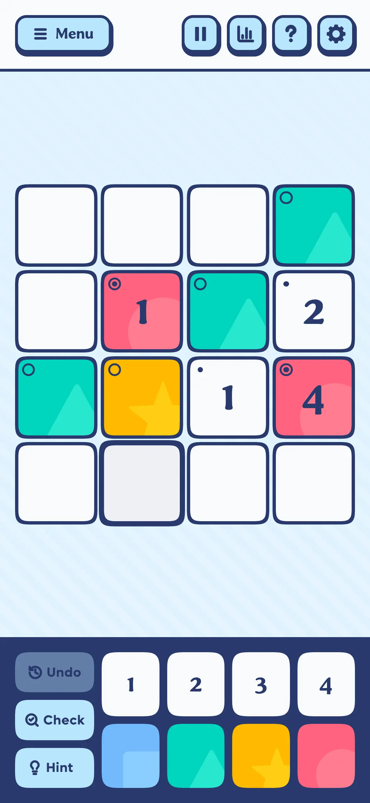
Admittedly, I considered light mode the “main” mode while designing, even though I myself am generally a dark mode fan. Maybe it’s because I’ve done so many puzzles in books, magazines, and newspapers, there’s something about it that just feels right on a lighter background.
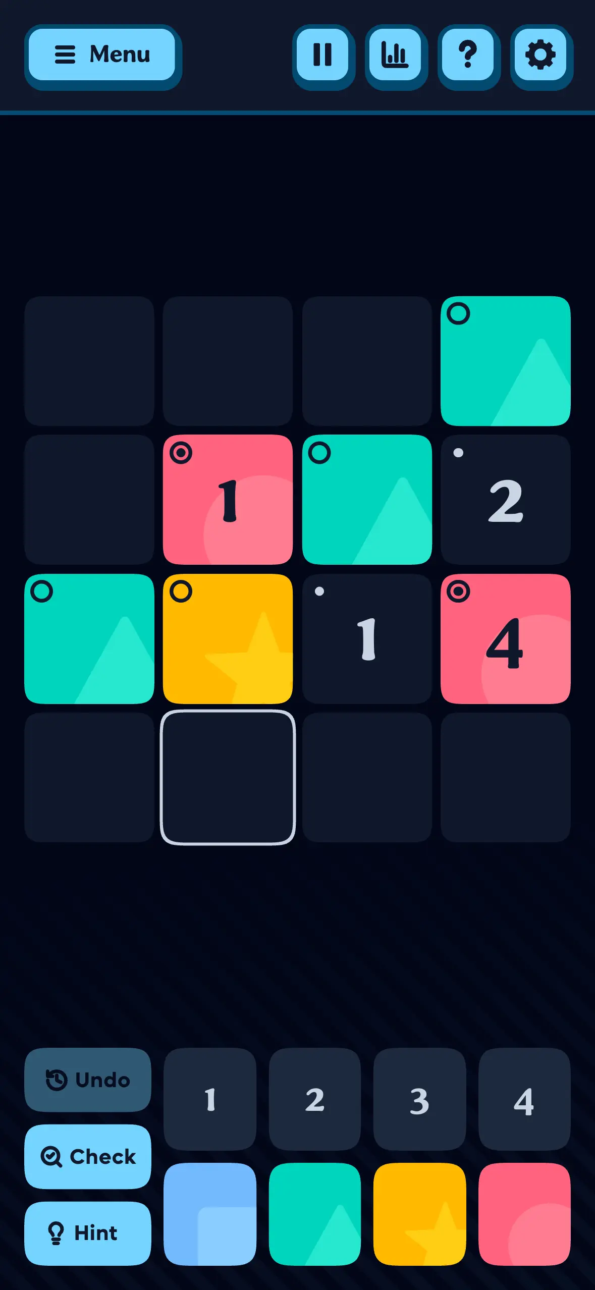
That said: I didn’t want the dark mode experience to be lacking. With this in mind, I set out to keep a strict parity between the two; I gave every color token a 1:1 mapping between the two modes, and swapped them out.
It didn’t work.
Shadows, infamously, don’t work in dark mode, but I started to think even the borders weren’t working as well as I’d hoped. The more I experimented with solutions, the more I realized the right decision was to not keep the themes identical at all.
I dropped the tile borders in dark mode, in favor of a solid single-color background. I let the sizes shift a bit. I dropped many of the shadows; in other places, I simply kept things the same color.
The less I treated light and dark mode like the same design, the happier I was with it. In the end, I even ended up using a lighting effect in dark mode that I didn’t in light mode, just because it didn’t make thematic sense or look as good there.
So, both modes diverged a bit, to the benefit of both. And they both have things I like now.
However: the tile colors remain the same in both modes, which I felt was important.
I also felt it was important to include a colorblind mode (I use it; I have color vision deficiency), and to make it not just work well, but look good. The stylized shapes, I think, handle that job well.
The architecture
If you know me as a developer, you know I love SvelteKit. I never seriously considered any other possibility for building my next thing. Even during prototyping, before I had any idea what shape the game would eventually take, I knew SvelteKit would make the work easy while providing anything I might need, simply and performantly.
For this project, I opted for Tailwind for styling, which might seem a little off-brand for me. Admittedly, I probably wouldn’t give you the sales pitch if you’re already happy with whatever you’re currently doing for styling. It’s just that I’ve been using Tailwind in my professional life for so many years now, I’ve started noticing I heave a sigh whenever I don’t have it available and have to go make a change. Once you get the muscle memory for styling components on the fly, changing whatever you want immediately without leaving where your cursor already is, it’s admittedly hard to go back and split your thinking apart again. I could’ve been happy using either vanilla CSS and/or scoped Svelte style blocks, too, but for better or worse, Tailwind has become the natural path for me. Plus, it provides some niceties I’ve grown accustomed to. It’s a system, and any system is better than no system.
The app is hosted on Netlify, and the puzzles are pre-generated using a GitHub workflow that runs weekly and keeps a healthy buffer built up. (The server’s set up to disallow access before the date rolls over, though, to keep anyone from playing ahead.)
Finally, though this phase of the project isn’t quite rolled out yet: the backend that manages your account, if you do decide to create one, is a PocketBase instance running on PocketHost, with email served through Resend.
Progressive web apps and the awful, awful app stores
Tupo is built as a progressive web app (PWA), so it can be installed on any device. For a time, I considered porting Tupo to the app stores, like I did with my other apps, but it’s honestly just too much bullshit to deal with for little to no reward.
It’s a daily game. None of the daily games I play and love are “real” apps, and they don’t need to be.
In fact, it feels thrillingly counterculture in this day and age to make something that’s “just” for the wide-open web, accessible to literally anyone with a browser and an internet connection.
It feels punk rock; it feels like a ragingly enthusiastic middle finger to the walled gardens—and I don’t think those two walled gardens get nearly the ragingly enthusiastic middle fingers they deserve.
The Play Store is actively hostile to small teams and solo developers. As I write this, they’re threatening to deactivate my developer account because I don’t publish often enough. (Which I don’t do because I have no reason to; the apps I have listed are finished and completely fine the way they are, but Google doesn’t seem willing to accept this.) But that’s only the latest in a very long line of terrible interactions I’ve had with the Play store and its remarkably unsupportive support team over the last several years. It’s obvious the Play store is not built for me, or any other solo devs or small teams; it’s built for huge companies churning out apps that make tons of money (because that, of course, is how the Play Store makes its money), which have a full-time staffer on hand to jump on all the store’s sudden random urgent requirements at a moment’s notice. I’m very tired of being forced to do some random paperwork over some sudden new tax law in a faraway country, when my apps are literally free anyway. I don’t make a penny off the Google Play Store, but they still make me jump through every hoop anyway. It’s a miserable maze of unclear and contradictory requirements. (It even doxxed my home address one time, and I had to pay like $100 to buy my way out of that problem, but I’ve gone on long enough.)
On the other side: while hosting apps on the iOS App Store is a moderately better experience, I pay more per year for the privilege of having free apps listed there than I do for my entire collection of domains put together. (Google only charges you once to set up your account; Apple locks you into a ~$8/month subscription just to be there.) Apple is also several years into a reputation-laundering campaign focused around rah-rah-ing Safari in order to make us all forget they’ve been actively kneecapping PWAs since the inception of the tech, in the name of some fabricated security concerns. They bury the install ability several layers deep, inexplicably under the share menu, and on the off-chance users actually find the option, Apple locks them into a proprietary browser (one you literally can’t run without paying for Apple hardware, it’s worth noting), which disallows or refuses to implement the necessary tech and APIs to make PWAs viable.
The overall experience of the App Store is better than the Play Store, but it’s clear Apple is far more aggressive in doing everything it can to protect the billions-with-a-b in revenue it skims off the top from other developers, with the obvious goal of preventing web apps from ever becoming a threat to their profit model.
Luckily, I’ve got just the right number of hands for both app stores.
Long live the web. 🖕🖕