Ten tips for better CSS transitions and animations
This is a followup to the post Understanding easing and cubic bezier curves in CSS. (This is also the original URL of that post.)
If you came here looking for that—or if you don’t already have a solid grasp on CSS cubic-bezier curves—I suggest reading that post now.
There are certain things you just know when you experience them, even if you don’t know where the intuition comes from, or can’t quite put into words what it is you recognize, exactly.
You might not know anything about interiors, but you feel it when you’re in a well-designed space.
Similarly, you can likely distinguish a good app from a bad app, even if you can’t explain what makes one feel better than the other.
In just that same way: users may not realize what it is about the transitions or animations on our websites and apps, but they can keenly spot the difference between good and bad. They intuitively know when an app’s movement feels good, and when the impression is instead generic or unpolished—even if they can’t explain how or why.
So to get a better understanding of what’s giving off those vibes—and how to sidestep the bad ones when building your own UIs—I’ve assembled this collection of things I’ve learned about crafting transitions and animations on the web over the last decade or so.
While “transition” and “animation” are distinct concepts in CSS, I’ll continue to use the words mostly interchangeably here, to mean “any kind of movement or change.”
1. Make it shorter than you think it should be
I get it; if you just poured your time and effort into creating a great transition, you want to enjoy it. If you’re like me (and most other developers), you might even just sit there admiring your fanciful animation, watching it transition back and forth in delight. But here’s the thing:
The absolute #1 dead giveaway of poorly designed movement is that it lasts way too long.
Your users aren’t as enamored—and therefore, not as patient—as you are. They came here to get something done, and they aren’t interested in waiting longer than they need to, regardless of how cool it may be.
My advice is: try to make your transitions as quick as possible, without being so short that a user might miss them. As a rule of thumb, I find that most single transitions work best somewhere in the 150–400 millisecond range (0.15 to 0.4 seconds). If you have back-to-back transitions—as one element moves out then another moves in afterwards, for example—you can double that, and add a little time between them, too. (You wouldn’t want the whiplash of two separate animations rushing by.)
Keep making it faster until it feels too fast, then back it off just a little.
That said, however: there are always exceptions, and the bigger the change is on the page, the more noticeable the transition should probably be. There’s a big difference between, say, a nice little accent animation for the number of items in your cart updating, and an entire page transitioning out. Don’t let big changes go by too fast.
One final point worth noting: an animation might not always feel as long as it actually is. A transition with a very slow ease-in might seem like it doesn’t start right away; conversely, a transition with a long tail might seem finished before it technically is. Keep that in mind. Perception is reality, so how the change feels is more important than what the duration technically is in the code.
2. Match the curve to the action
Admittedly, this is easier said than done. You might be saying “ok, great, but how do I actually know which kind of cubic bézier curve to use in any given situation?”
The unsatisfying answer is: trial-and-error (otherwise known as experience) is the best teacher here.
Movement is as subjective as color, but it’s also as important. It’s a key part of the feel and branding of your website or web app.
That said, there’s a trick to keep in mind: as you experiment, think of movement in the real world, and compare it to the movement you’re working with in your app. Is this transition a positive confirmation, appearing and sliding into place? That might call for a speedy intro with a smooth but quick easing out, like an eager helper running up to report their task is done.
How about a failure message appearing on the screen? That might call for a slightly slower easing curve, to indicate a slight reluctance.
If it’s something important that should be known about immediately, speed and apparency would be a priority. If it’s highly critical, it might even call for a more aggressive movement (like shaking), to convey the severity and draw attention where needed.
So my best recommendation is: invest the time, and ask whether the movement conveys the appropriate feeling. Does this movement seem consistent with the brand of the product or page?
If Pixar animated a robot that did the thing your UI is doing, how would it move?
3. Accelerate and decelerate
In the real world, we pretty much never see any type of movement jump immediately to max speed, or come to a full and complete stop instantaneously. So our UIs will seem a little more “real” and intuitive if we avoid curves that create that kind of movement, too.
When something seems off about an animation, odds are it’s because it either starts or ends with unnatural suddenness.
Even if it’s slight, I’d still recommend adding a bit of easing in and out to your cubic-bezier curves. That small but detectable bit of acceleration and/or deceleration could be the difference between a transition that feels smooth, and one that seems just a little off.
Take a look at this demo, where all four squares rotate a full turn, but with different easings applied:
Notice how the first and second squares above seem to start or end much too abruptly.
The third “smooth” option works much better, as its custom curve eases in and out for a more graceful movement that accelerates and decelerates.
If you want to go even further toward animation that feels like it has real-world physics applied, the fourth “inertia” option works well, too; it “winds up” and overshoots, as though powered by a spring. (Just bear in mind: a little goes a long way with this type of animation.)
One important note on sudden starts and stops, though: it’s fine if the user can’t see it. If the object in question fades in, then a sudden start might be fine (since the beginning of the animation won’t be perceptible in the first place).
The same goes in reverse; if an element is fading to opacity: 0, then it may not matter exactly how the transition curve ends, since it won’t be visible at the end anyway.
4. Less is more
A lot of these tips could be pretty well summarized as “less is more.”
It’s easy to get carried away and make every single thing on the page animate in. (I’ve certainly been guilty of that.) But unless this is your personal website and you just feel like going a little wild, too much movement can easily do more harm than good. When it comes to transitioning things with CSS, understated is usually better than overstated.
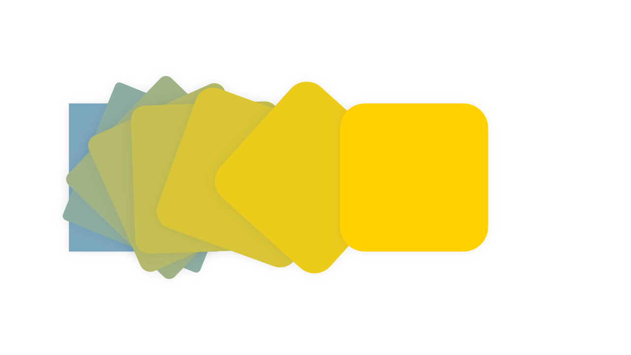
The more an element changes during an animation, the more the transition risks seeming overdone.
If you’re animating opacity from 0 to 1 (or the other way around), maybe try a smaller range, like 0.4 to 1 instead. If your element scales up to full size, try making it just slightly smaller to start, rather than so small it can’t be seen.
Does an element slide into place? I find that in most cases, movement like that should be in the range of about 5–40 pixels. Any less, and the movement may be too subtle to even notice; much more, and a smooth slide may become a clumsy crash.
Here’s an example of a transition that animates opacity, translateY and scale. Compare the first pronounced, drawn-out animation (orange), next to the very same transition, but toned down and a little quicker (blue).
Doing too much can be worse than doing nothing at all. So find the point where the transition is just enough to be effective, and if you go further, do so cautiously.
5. Avoid browser defaults
You may already know the browser has some built-in easing curves available to use: linear, ease, ease-in, ease-out, and ease-in-out.
However, while these five named timing functions are convenient and useful in some situations, they’re also very generic. (Many of the animations built into tools and libraries online fall prey to the same homogeny, even if they do offer a wider range of choices.)
If you want to get the most out of movement, you should reach beyond the most common off-the-shelf named options.
Just as a site built with Bootstrap or Tailwind defaults risks looking generic, off-the-shelf easing curves can often make UIs seem bland and homogeneous.
As an alternative, VS Code has an amazing autocomplete for cubic-bezier curves with a wide range of options; start typing cubic-bezier in a CSS context, and you should see the following dropdown appear:
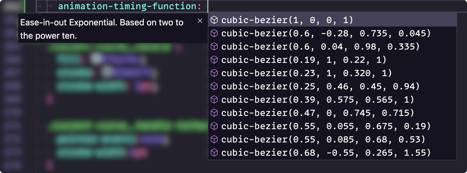
All of those options are covered in my easing playground, if you’d like to take a look and play with the presets.
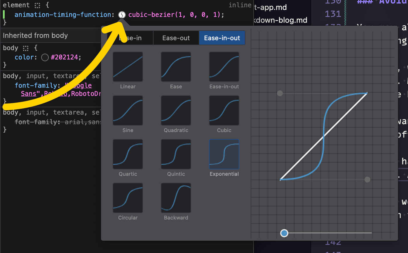
Another excellent option: open your browser’s dev tools and play with the easing curves in there.
Every major browser has an easing panel available as a sandbox to try different options and make adjustments. To access it, open dev tools, and click the curve icon next to a cubic-bezier value in the CSS styles panel. (The icon varies, but the workflow is basically identical across all browsers.)
However you choose to define your easing curves, though: I recommend you take some time to make subtle tweaks. Use cubic-bezier, and don’t be afraid to tinker.
You can certainly get by with the presets in the browser, or in VS Code. And if you’re using cubic-bezier over keyword values, you’re ahead of the game already.
That said, though: you probably wouldn’t limit your color palette to only predefined CSS named colors. So you might not want to limit your transitions to a small handful of preset curves, either.
6. Multiple properties, multiple easings
While this one won’t always come in handy, there will be times you’ll be animating more than one property at once on a single element, like when you scale an item with transform as its opacity also changes.
You could apply the same cubic-bezier curve to both properties, as shown here:
/* ⛔ Ok, but can be better: */
.my-element {
	transition: all cubic-bezier(0.5, 0, 0.5, 1) 0.5s;
}

/* ⛔ Also maybe not ideal: */
@keyframes scale_and_appear {
	from {
		opacity: 0;
		transform: scale(0);
	}
}

.my-element {
	animation: scale_and_appear 0.5s cubic-bezier(0.5, 0, 0.5, 1) forwards;
}
Depending, that might look just fine. However, there will be situations where the same curve doesn’t really work for every property being transitioned.
The easing curve that works well for the transform may not feel right for the fade. That’s when it’s handy to set a unique easing per CSS property.
In those cases, you can split the @keyframes animations by property, or specify multiple transitions. Then, you can specify a different curve for each property, since both transition and animation can accept multiple values:
/* 👍 Better; each property has its own curve */
.my-element {
	transition: opacity linear 0.5s, transform cubic-bezier(0.5, 0, 0.5, 1) 0.5s;
}

/* 👍 Use two animations and apply both */
@keyframes scale {
	from {
		transform: scale(0);
	}
}

@keyframes appear {
	from {
		opacity: 0;
	}
}

.my-element {
	animation: scale 0.5s cubic-bezier(0.5, 0, 0.5, 1) forwards, appear 0.5s linear forwards;
}
Here’s a demo; as the boxes alternate in and out, notice how opacity and scale follow the same acceleration for the square on the left. On the right, however, opacity follows its own linear curve.
Which one is better? Well, that all depends on the effect you’re going for.
Again, this one may not come up too often, but it’s very handy when it does, and also easy to forget about, so it gets a spot on the list.
You could even go so far as to change the duration of each property, but be careful things don’t go out of sync if you decide to get that wacky.
7. Use staggered delays
When transitioning multiple elements (or one element with many parts), don’t underestimate the effect animation-delay or transition-delay can have—particularly when staggered.
Take a look at this CodePen example; each line uses a new kind of animation delay to create a different effect:
In the pen above, the first line just transitions all at once. Fine, but not particularly sharp.
In each line following, however, varying degrees of delay are applied to each letter, to create a playful “bounce-in” effect. There’s even one that goes backwards, and one that causes the line to appear from the middle out.
However, remember less is more. It’s very easy to overdo animations like this, especially when there are lots of elements transitioning. I made that example much more overstated than I’d generally recommend, just for demonstration purposes. It’s probably a little too busy for most UI work.
That said: there are opportunities to apply this effect on a more subtle scale. Dots in a loading screen, maybe? Perhaps when a drawer or hamburger menu is opened, each item might appear on a slight delay?
Again, keep it short and subtle. But where applied well, staggered delays can help take web transitions to another level.
8. Ins go out, outs go in
If you’ve looked at various kinds of easing curves, you may have noticed they tend to come in three varieties: an ease in (starts slower), ease out (ends slower), and in-out (which is essentially both; faster in the middle and slower at the beginning and the end).
The tricky thing with transitions is: you often want your transition in to be an ease-out, and your transition out to be an ease-in.
Ok, that was probably as confusing for you to read as it was for me to write. Let’s back up.
Say you’ve got an animation where one element leaves the page as another one appears to take its place, like a page transition, or sliding between two images in a lightbox.
The user perceives this as one UI transition. But under the hood, it’s actually two transitions: the old element leaving, followed by the new element entering.
So that means if you’re transitioning an element out, and you want it to start slowly, you need an ease in.
Conversely, when an element is transitioning in, it should usually come to a gradual stop. That calls for an ease out.
Those two would come together to create the effect of one seamless movement.
9. Lean on hardware acceleration
Not all CSS properties can be animated or transitioned smoothly across all devices and browsers. In fact, only a handful are capable of tapping into a device’s hardware acceleration for the smoothest, highest-framerate transitions possible.
It’s not important to understand what hardware acceleration is in order to take advantage of it. But if you’re curious: it means the browser can enlist the help of the device’s graphics processing unit (GPU) to help make rendering significantly faster and smoother—but only under certain conditions.
Properties that can always be hardware-accelerated:
transform(including every form oftranslate,scale, androtate, plus all their3dcounterparts)opacity
Properties that can sometimes be hardware-accelerated:
- Certain SVG properties
filter, depending on the browser and the filter
Some other non-CSS things, like canvas and WebGL, can tap into hardware acceleration, too. I won’t go into those here, however.
The tl;dr of all the above is:
If you want to move, scale, or rotate an element, always use the CSS transform property.
Applying a transform won’t affect layout, which minimizes recalculations and keeps the browser humming along smoothly. Handily, many of the most common animations and transitions you might use on the web can be achieved using some combination of transform and opacity.
But whatever you do, avoid changing the size or placement of an element directly. If you change a property that could potentially affect the layout of the elements on the page—height, width, border, margin, padding, etc.—you risk noticeably slowing down the page with the calculations required to make that change.
If you do need to animate such properties, be sure to test in every possible device and browser. In my experience, Safari in particular is very bad about processing animations in a performant way by default, especially on iOS. Firefox isn’t far behind, but you might not realize it if you’re only testing on high-powered devices. A lot of the world lives on budget Androids; don’t leave those out of your testing.
Just because something can be hardware-accelerated doesn’t mean it will be. The browser makes the final call.
One potential reason it may opt out: the GPU is faster, but it also consumes more energy. So if the device is low on power, or in battery-saving mode, the browser may choose battery over graphical performance.
10. Use will-change as needed
If you do run into issues with animations that should be smooth and performant in theory, but that seem choppy or stilted in practice (again: this is usually in Safari for me, but your mileage may vary), make use of the will-change property.
I won’t go too far into the technical details, but will-change essentially lets you tell the browser what will change (easy enough to remember), so it can skip over other calculations. It’s a little like letting the restaurant know ahead of time that your whole party will be ordering only from a limited menu; it saves time by letting the kitchen/browser know what to focus on, and what it doesn’t need to care about.
An example: if you know for sure the only thing that’s going to change with an element is its transform property, and can confidently let the browser know ahead of time via will-change: transform, it can safely skip all the other steps it might otherwise go through to re-render that element when something changes on the page.
Best-case scenario: when used with properties that don’t affect layout, this lets the browser offload the computation entirely to the GPU for the highest framerate, and smoothest performance.
However, will-change is not a silver bullet. In fact, if over-used, it can actually harm performance.
That’s because the browser creates a new layer (kind of like a new z-index level) for every element that has will-change applied to it, making things a bit more complex to composite. Used judiciously, this exchange is worth the price. Used carelessly, however, it could create even more work for the browser. From MDN:
Warning: will-change is intended to be used as a last resort, in order to try to deal with existing performance problems. It should not be used to anticipate performance problems.
Some sources even go so far as to recommend applying will-change prior to an animation or transition, and then removing it afterwards.
So here again, the best advice is: test thoroughly.
Bonus: respect the user’s preferences
Users can indicate via their device settings whether they prefer reduced motion.
The reasons a user may do so are many and varied. There’s a range of medical reasons, for starters: a user may experience vertigo, nausea, or even seizures when exposed to excessive movement. Or, a user may just find too much movement distracting or obnoxious.
It doesn’t really matter why, though; it’s our job as developers to accommodate the user’s preferences regardless.
We can either do this in CSS, using a media query (like this, from MDN):
@media (prefers-reduced-motion) {
	/* styles to apply if the user's settings
     are set to reduced motion */
}
Or we can use JavaScript. In this example, we’ll check for a reduced-motion preference, and add a class to the <html> tag if found:
const prefersReducedMotion = window.matchMedia('(prefers-reduced-motion: reduce)').matches;

if (prefersReducedMotion) {
	document.documentElement.classList.add('reduce-motion');
}
Following that JavaScript example, we could then add CSS to target elements on the page to set overrides:
.reduce-motion {
	/* Select stuff here and reduce motion */
}
Just note that when using JavaScript, we’d want the page to be progressively enhanced, in order to ensure there was no flash of motion before the script ran, and no excluding users who have JavaScript disabled. So a mix of both techniques is ideal.
As far as what, exactly, we should do with our CSS in these cases: remember that reduced motion doesn’t mean no motion, or even no animation at all.
One technique I often use is: change up keyframe animations to only use opacity where a reduced motion preference is detected:
@keyframes slide_in {
	from {
		opacity: 0;
		transform: translateY(2rem);
	}
}

@keyframes slide_in_reduced {
	from {
		opacity: 0;
	}
}

.animated-thing {
	animation-name: slide_in;
}

@media (prefers-reduced-motion) {
	.animated-thing {
		animation-name: slide_in_reduced;
	}
}
Just because a user prefers minimal motion doesn’t mean they don’t value transitions.
Plus, there are some situations where it may be better to keep movement intact. For example, if you show a progress bar as something loads in the background—or a playback indicator on an audio or video file—that’s a key piece of information in the UI. Rather than eliminating that indicator altogether, consider finding a way to make the movement subtle and unobtrusive. Potentially, allow the user to hide the movement. Or, representing the info differently may be the way to go (a numerical percentage counter instead of an animated bar, as an example).
At the very least, users should be able to pause all continuous animations, including videos and gifs. However, ideally, we should be anticipating their needs based on their device preferences, instead of forcing them to deal with something they’ve already indicated they’d rather not see.
I refer you to this piece by Val Head for Smashing Magazine, for a deeper dive on the topic of designing with reduced motion. It’s a big topic in its own right, but hopefully this tip provides some general guidance.
Putting it all together
This CodePen demo helps to illustrate how putting the tips in this article all together can completely change the feel of a UI transition. Click the “run animation” button on either side to see that column’s items transition in.
Notice how both sides have essentially the same animation; the boxes scale, move, and fade in in both cases. But the details of that transition completely transform the effect (no pun intended).
On the left (red-orange) column, the items have no delay staggering; they all fade in at once, with a huge swing in opacity, position, and scale. The transition also lasts a pretty long time, and uses the browser default ease-out curve—which isn’t bad in this case, but it’s not optimal, either.
On the right (blue) column, on the other hand, the animation is staggered so the items enter one after the other. The delay and the total transition time are both fairly minimal, and the effects are all still there, but much more subtle. Finally, the easing is a custom cubic-bezier curve.
Hopefully this demo makes it easy to see what a huge difference some small tweaks can make.
Wrap-up
Best of luck crafting your own animations on the web! I hope this post has been engaging and useful, and you feel better equipped to make even stronger interactive experiences.
As always, feel free to send feedback or questions below, and thanks for reading!