Why you should never use px to set font-size in CSS
Forgive the clickbait title; “never” is a strong word, but this is an important, and poorly understood topic.
There are quite a few misconceptions that float around in the sphere of web development, and persist no matter how often they’re debunked. “External links should always open in new tabs” is one good example. CSS Tricks covered this one pretty thoroughly here nearly a decade ago (tl;dr: mostly false), but it still seems to persist in some corners.
Case in point: the idea that there’s no functional difference between px, and em or rem units in CSS. It’s a misconception I keep hearing again and again, so I figured I’d address it here, in a post.
Let’s be very clear: it absolutely does matter what unit you use in your CSS. And you should avoid px when setting font-size wherever possible.
Again: “always” is a strong word, and a bit dogmatic. But the truth is: if you pick the wrong unit, you risk overriding your users’ preferences, making it harder (maybe even impossible) for them to use your website, and potentially harming the design with unintended visual side effects.
What units are we talking about, and what do they do?
Before we get into why we should avoid px for font-size, let’s make sure we’re all clear on what units we’re talking about, and how they behave in general.
px
px is short for pixel…although it’s not literally a pixel most of the time anymore. It used to be, back when displays tended to be a pretty predictable, low-resolution pixel ratio, like 1024×768. In those days, 1px was typically equal to one actual pixel on the physical screen.
Screens display images using a grid of colored lights called pixels. One pixel is one colored light on the display; the smallest possible “dot” the hardware is capable of rendering. This is what I mean by “literal,” “actual” or “device” pixels in this section; a pixel in the physical world.
However, when high-resolution (sometimes called “retina”) screens came along, and devices started to pack more pixels into less space, those physical device pixels became super tiny. Browsing the web on a high-res screen, it would’ve been extremely difficult to even read anything if 1px in CSS still corresponded to one literal device pixel, as pixels themselves were rapidly shrinking. Modern smartphones have resolutions even higher than HD TVs, after all.
So instead, browsers on high-resolution displays scale up what they show (zoom in, more or less), so that webpages aren’t illegibly small. Images and such can still be displayed in all their high-res glory, but text and other elements are upsized to maintain legibility.
So these days, 1px generally corresponds with the size of a scaled-up, “zoomed-in” pixel, rather than a literal pixel on the actual hardware. Something that is 1px in our CSS will likely take up multiple physical hardware pixels, and we don’t really have any way in pure CSS to specify a literal device pixel. But that’s fine, because they’d generally be too small for us to want to mess with anyway.
An example: pixels on the iPhone 14 Pro are so microscopic that 16px, in literal device pixels, would be about the size of printed type at 2pt font size. Good thing browsers scale those up for us!
Most of that isn’t really important in the context of this discussion, but I think it’s nice to know anyway. The important part is: 1px is equal to whatever the browser is treating as a single pixel (even if it’s not literally a pixel on the hardware screen).
em and rem
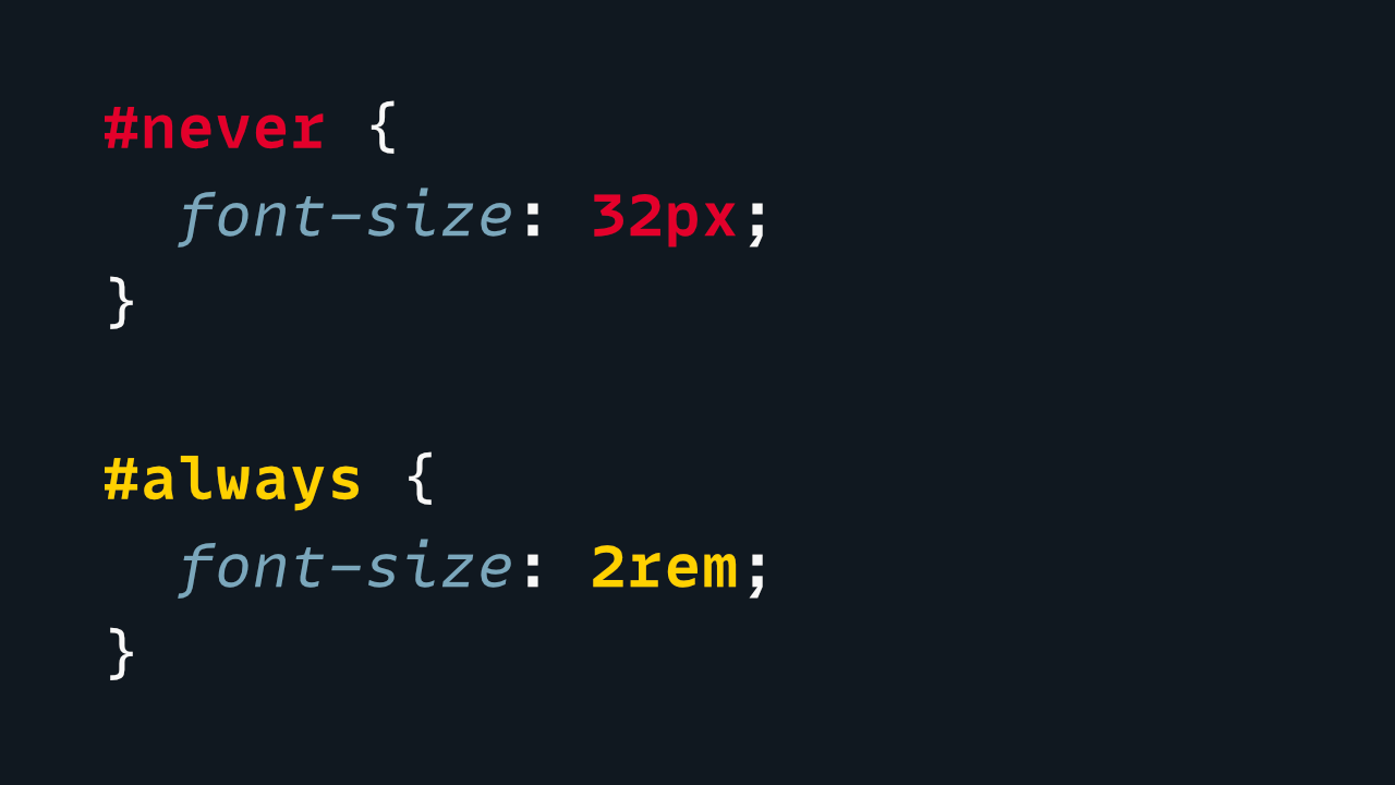
That brings us to em and rem, which are similar to one another. To keep on with the not-strictly-relevant-but-still-interesting trivia: “em” is a typographic term that actually predates computers by many decades. Typographically, one em is equal to the current font size.
If you have your font size set to 32pt (“pt” is point, another old typographic term still sometimes used), then 1em is 32pt. If the current font size is 20px, then 1em = 20px (though again: you shouldn’t set font sizes in pixels—this is just for the sake of example).
On the web, the default font size is 16px. Some users never change that default, but many do. But by default, at least, 1em and 1rem will both be equal to 16px.
Em originally referred to the width of an “M” character, which is where the name came from. But it now refers to the current font size, rather than to the dimensions of a specific glyph.
The difference between em and rem
To differentiate between the two: 1rem is always equal to the browser’s font size—or, more accurately the font size of the html element. rem stands for “root em,” and the root of a webpage is the <html> tag. So, 1rem = whatever the document font size is. (Which, again, by default, is 16px, but can be overridden by the user.)
em, on the other hand, is the font size of the current element. Take the following CSS:
.container {
	font-size: 200%;
}

p {
	font-size: 1em;
}
Given the above CSS, paragraphs inside the .container element would be twice as big. That’s because 1em means “the current font size,” and inside the .container, that’s 200%. 1em × 200% = 2em (32px by default).
Paragraphs outside the .container element, however, would still be the normal font size of 1em (16px by default).
If we changed em to rem in the CSS above, then all paragraph tags would always be the browser’s default font size, no matter where they were.
font-size: 1em is equivalent to font-size: 100%.
em and % units are not always equivalent in other contexts; for example, width: 1em and width: 100% would most likely be very different, since in that case, the percentage is based on the parent container’s width, and not its font size. But % and em are the same as far as the font-size property is concerned.
So to summarize:
1emis the current element’s font size1rem(root em) is the document’s font size (i.e., the browser’s)
All right; that’s what the units mean and where they come from. So now let’s answer why it matters which we use.
Why this all matters
Again, the common misconception is: since 1em is equal to 16px anyway, it doesn’t matter which unit you pick. And that seems logical; if 16px = 1rem, then why would it matter which way you choose to type it?
Remember, em and rem are relative; by default, they’re both (ultimately) based on the browser’s font size.
px, however, is not; it’s just a static value that isn’t based on or affected by anything else.
2rem is double the browser’s font size; 0.5rem is half of it, and so on. So when or if the user changes their preferred font size, if you’re using em and rem, all the text on your website will change accordingly, like it should. 2rem is still double that font size; 0.5rem is still half of it.
By contrast, px values are static. 20px is just 20px, regardless of the container’s, browser’s, or user’s font size. No matter how large or small the user’s font preference may be, when you set a value in static pixels, it clobbers that choice and overrides it with the exact value you specified.
Critically, that means if your stylesheet uses px to set font-size anywhere in it, any and all text based on that value will be impossible for the user to change.
em and rem work with the user’s font size; px completely overrides it.
That’s a very bad thing. It’s inaccessible, and may even prevent somebody from using the site at all.
So while there may be some valid use cases for that behavior, it’s definitely not what you want as a default.
This is also a very good reason to avoid viewport units, like vw or vh, when setting font size. Those are also static, and impossible to override by the user.
At most, a value like calc(1rem + 1vw) might be acceptable, since that still contains rem as a base. Even then, however, I’d recommend using clamp() or media queries to set minimum and maximum values, as screen sizes often go far beyond what we might expect or test.
Differences beyond font size
Ok, now let’s talk about how px and em/rem vary even when we’re not dealing specifically with the font-size property.
Developers commonly test by zooming the page in or out, and I think that’s where the misconception at the heart of this post comes from. When you zoom, everything gets scaled up (or down), and in that scenario, the choice of px or em/rem as your CSS unit doesn’t generally matter. Both behave the same way, as far as zooming is concerned. And most developers priveleged with good eyesight probably won’t realize there’s more to it than that. However, the tricky thing is:
Even beyond font-size, px does not behave same as em and rem.
px units are still tied to the scaled value of pixels on the screen. em and rem, however, are tied to the document’s font size, and not to the zoom or scale of the page.
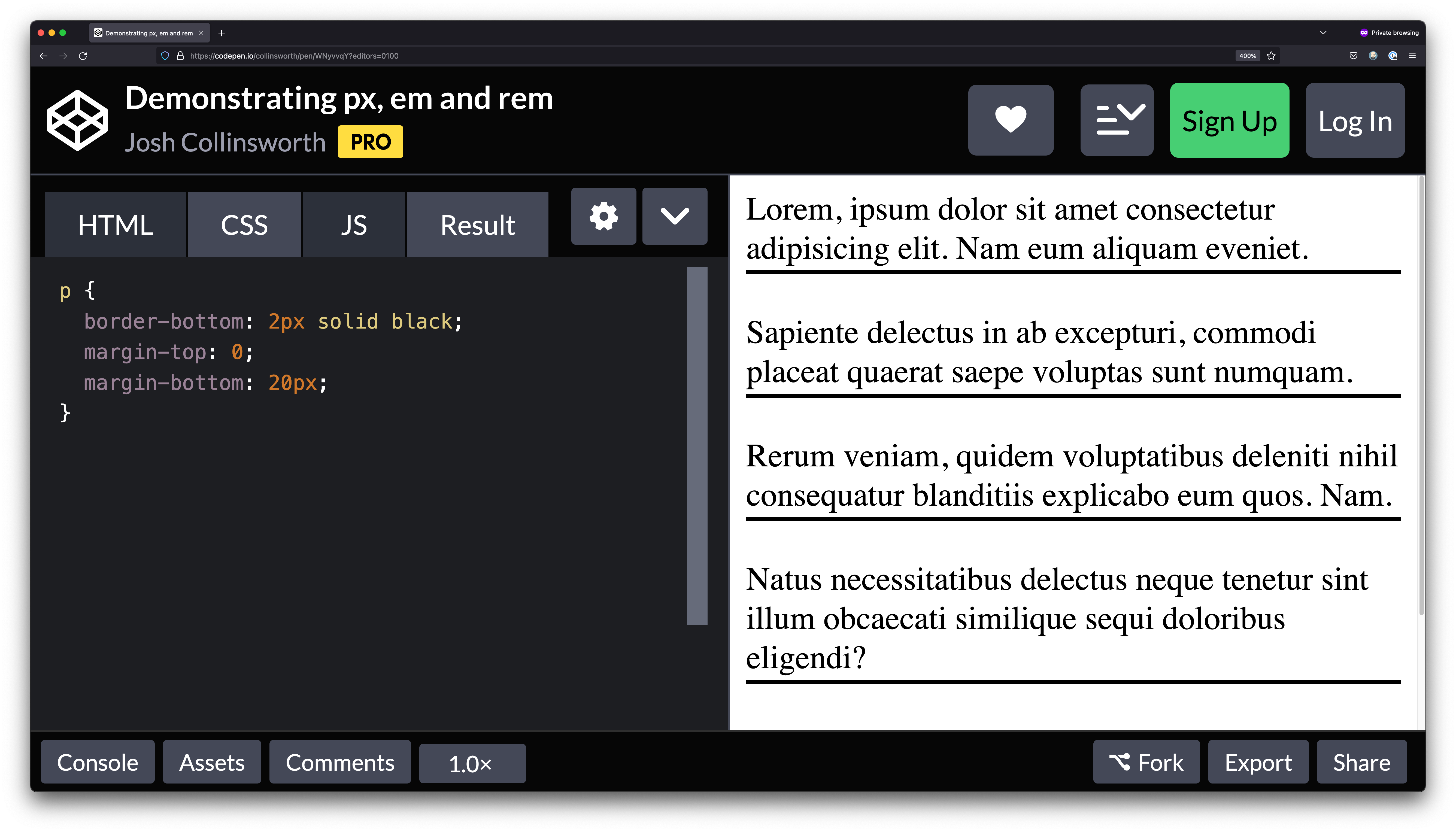
To demonstrate, take a look at this CodePen:
We have a few paragraphs, each with a 2px border on the bottom, and 20px margin between them. Notice, we’re using px units for both.
If you zoom in or out, the size and distance of the elements stays relative. That is: the more you zoom in, the thicker that line gets, and the bigger that space between paragraphs gets.
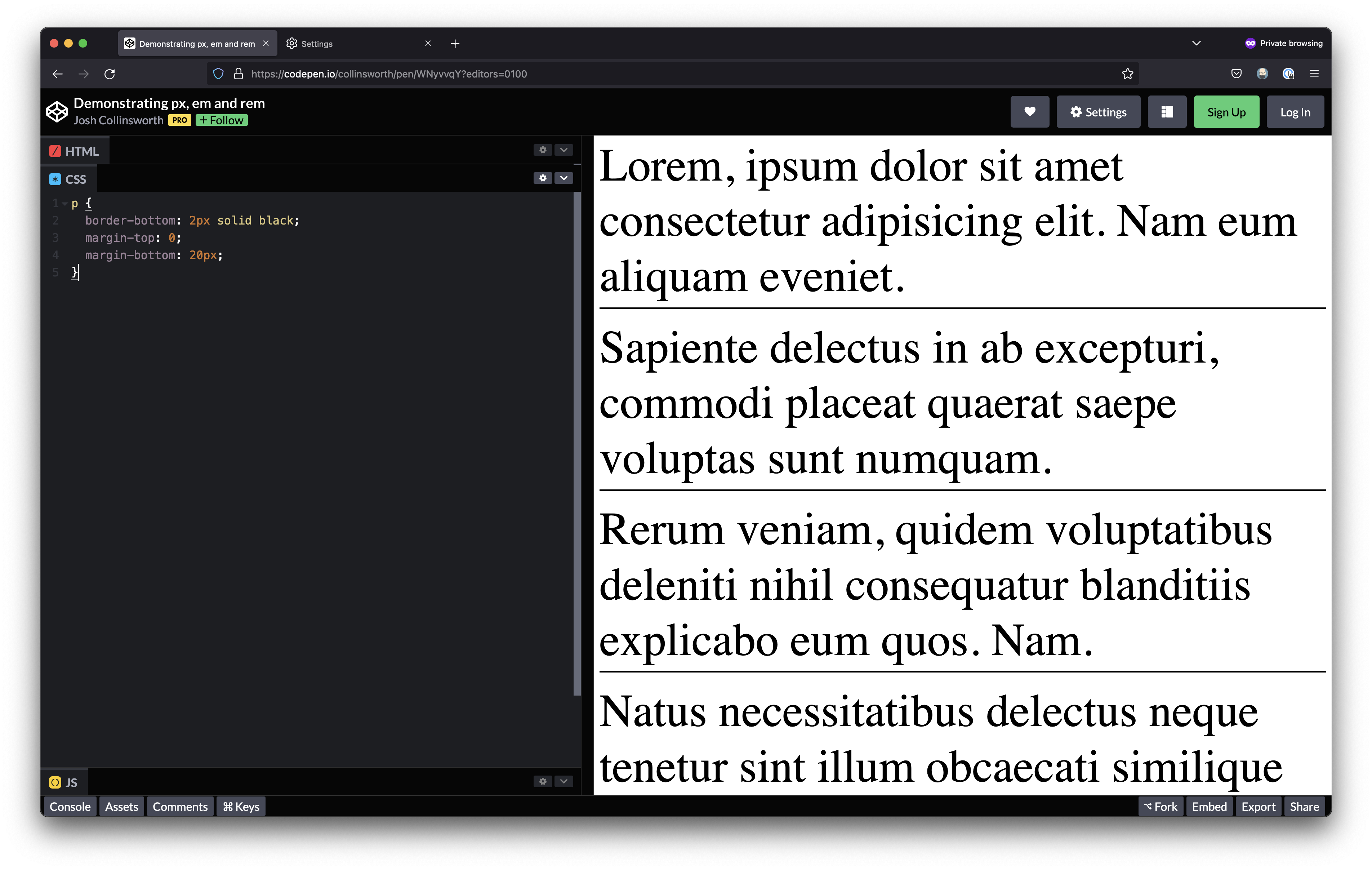
To save you the trouble, here’s a screenshot, showing that same pen at 400% zoom. The text, the line, and the spacing are all 4 times larger; they stay the same size relative to one another:
When it comes to zooming in and out, there’s no real difference between px and em or rem. But zoom isn’t the only way users make websites more usable for themselves.
As mentioned before, users can also specify a default and/or minimum font size. And when they do that is where the functionality begins to diverge.
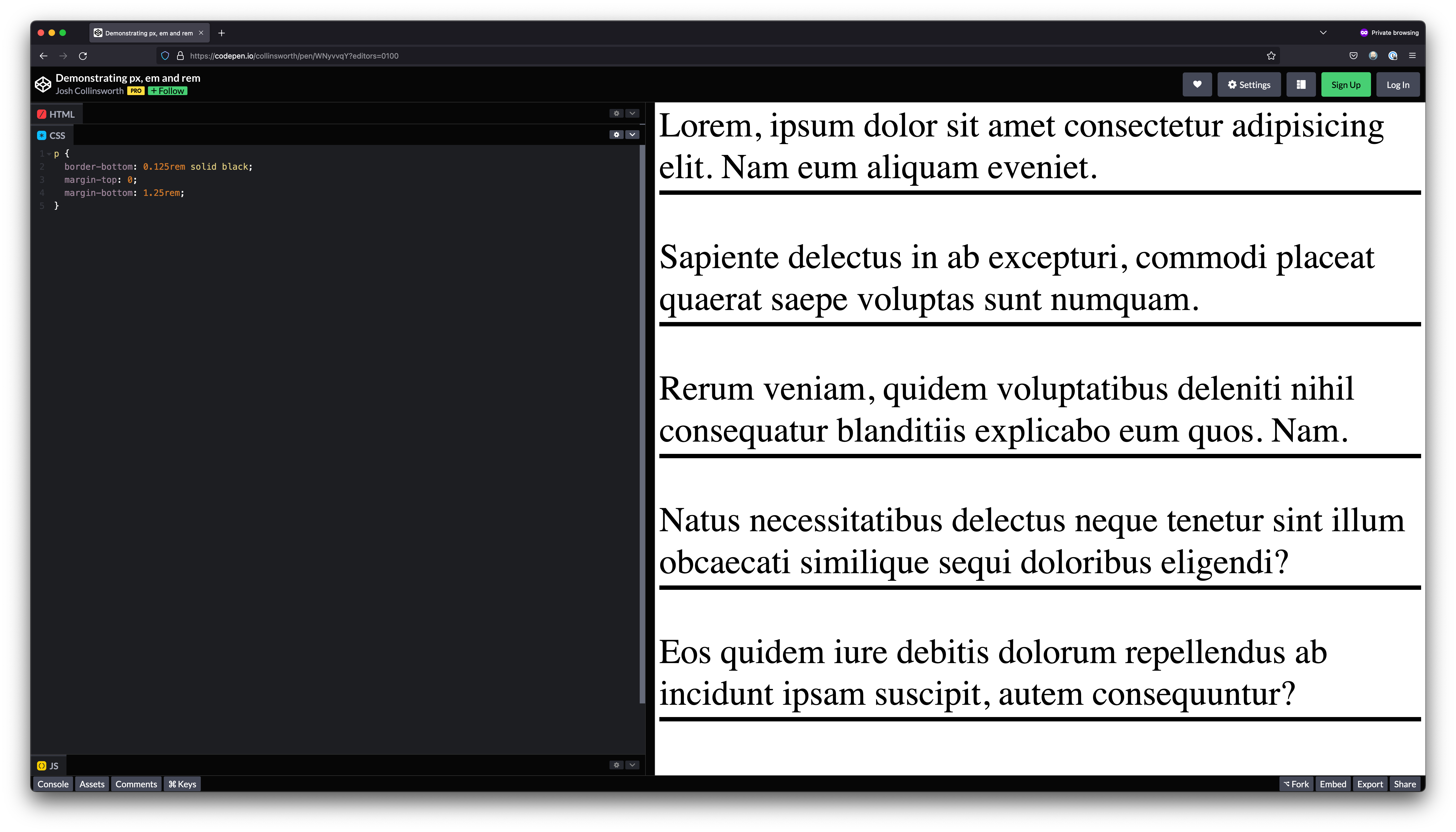
In the screenshot below, I’ve set Firefox’s default font size to 64px. Have a look:
Compare the text that screenshot with the text in the one above it. Notice how this time, the lines are not thicker, and the margins between paragraphs have not grown proportionally. Only the text itself is larger. Because the border width and margin were both set in px, they stay as they were, and do not scale.
You’ll notice, however, that if you change the px in the CSS to the equivalent rem values, the lines and spacing do get bigger!
This all means there are important, realistic design reasons to choose px over em and rem, or the other way around.
So to summarize here:
pxvalues do not scale up or down when the user changes their font sizeemandremvalues do adjust in proportion to font size
If you’d like an interactive demo that ties all this together, check out this final CodePen; adjust the slider at the top to see the effect modifying the document font size has on various elements, based on the CSS unit they’re using.
Which to choose
So, knowing that em and rem will scale in relation with font size, but px values will not, where does that leave us? Should we just never use px for anything!?
While I think you’d probably be ok going down that path if you so choose, I do still think there’s a place for px.
Since we know that px values won’t change when and if the user adjusts their font size, that means pixel units are actually a great choice for some aesthetic elements. Maybe we have a certain spacing that we wouldn’t want to get larger when the font size is bigger. (If it’s a big block of negative space by default, maybe it wouldn’t make sense to allow it to scale to an even more massive size.)
Maybe there are border sizes we wouldn’t want to change, or maybe there are decorative elements on the page, created with CSS, that wouldn’t seem to work well at a larger size, just because the font is larger. Maybe we don’t want padding to balloon as font size does. px is still a good choice in all of these cases.
Me, personally: I would recommend setting all sizes using rem. I sprinkle in em only where I want something to be proportional to the current font size (e.g., an icon next to some text that should be exactly the same height as the characters, and half a character to the side). I would not use px anywhere, except for design elements I explicitly did not want to scale with font size.
But once more, if you take anything away from this post:
Never set font-size in px units—at least, not unless you’re incredibly sure of what you’re doing, how it will behave, and whether it will still be accessible when you do.
An important note about media queries
This is a late addendum to this post, but: it’s important to avoid px in @media queries for all the same reasons above; it will work fine when the user zooms, but a media query that uses px will fail users when they set a larger font size on their own.
@media (min-width: 800px) {
	/* Changing font size does NOT affect this breakpoint */
}

@media (min-width: 50rem) {
	/* Changing font size DOES affect this breakpoint */
}
That’s because as the font size scales up, 50rem becomes a different value based on that preference, while 800px does not.
Most likely, when we’re writing CSS for larger breakpoints, we’re taking for granted that there’s plenty of screen real estate for elements to spread into. This may not be the case if the user has set a very large font size, and setting our media queries in rem instead of px helps us avoid that assumption and respond to user preference.
I ran into that issue on this very site; I was setting all of my breakpoints in px. When I set the default font size larger, however, my media queries didn’t respond, as they were still only looking at the pixel width of the screen. So I still had a tiny sidebar, with huge text illegibly smashed inside it, since I didn’t account for user preference. I changed to rem immediately after that, and it solved the issue.
So in short: be sure to avoid using px in media queries, too, unless you’re sure you know what you’re doing and what effect it will have on users who set their own font size in the browser.
A final word on accessibility
Accessibility guidelines generally only stipulate that web apps should be usable at up to 200% zoom and/or font size. You’ll notice the above demos go way beyond that.
That’s partly just for contrast, but it’s important to note that many users will go far beyond as well, as their needs and preferences dictate. A person with poor vision won’t simply stop at 200% if it doesn’t work for them. We should be doing our best to include them, building our sites and apps to be legible and workable regardless.
I’ve heard some in tech argue that their users are young and/or tech-savvy, so people who need large font sizes are not in their audience, and therefore, need not be considered. But I’d like to stress that’s wrong, presumptuous, and frankly, ableist.
Even aside from the inherent ageism in that argument, needs vary even among young people. Disability doesn’t have an age threshold. I personally know someone in their 30s, employed as a full-time developer (i.e., plenty young and tech savvy), who has to set a minimum font size significantly above the default because of their vision. Websites and apps are regularly broken for them, sometimes to the point of being unusable, because developers fail to consider their needs.
I call this all out to highlight the importance of testing UIs as our users might. Above, I was using 64px, and admittedly, that seems like a pretty extreme selection, being a full four times the default…but then again, what if it’s not? What if a user genuinely needs that? Effectively telling a user “you need too much” is not something we should be comfortable doing when it comes to accessibility.
There will always be practical limits to what we can accommodate, of course. But regardless, we should at least go as far as we can. Even if 4x itself isn’t always feasible, there are lots of possible options between 100–400% that users might realistically choose and rely on, and we should be doing our best not to get in their way. If nothing else, what we build on the web should at least be flexible enough to go well beyond the defaults.
16px is just a default. It’s not a norm, it’s not a target, and it shouldn’t be an assumption. We can, and should, do better.