Pantone, Color, and What I Wish I Had Known Sooner as a Designer
One of the most difficult things for me to learn in my transition from the classroom to a professional branding agency was how to properly handle color output. Sure, I learned in my classes how to open the swatch palette and find the Pantone swatch I wanted, but how to properly utilize that swatch and ensure its consistency across all print and web mediums—this was something new to me.
Don’t get me wrong; I had great teachers. But little in a classroom environment compares with the task of creating a comprehensive logo and stationery package for a real-world client. (Plus, the print overview course at my school was an elective that I didn’t…er, elect.)
Trust me: it’s no fun having to redo 300 logos because you didn’t get the colors exactly right. So I decided to write this post in the hope of saving you some from some of the pitfalls that I failed to avoid.
An explanation of spot colors
Let’s refresh ourselves on the printing process.
As you probably know, most color printers create color by mixing cyan, magenta, yellow and black inks. This is called CMYK, 4-color, or “process” printing (and by the way, the K in CMYK stands for “key,” as the black color plate was once referred to as the key plate, in case you were wondering). Cyan plus magenta equals blue, magenta plus yellow equals red, and on and on. CMYK is very popular because it’s cheap, and most colors can be recreated decently within the process printing color range, also known as a “gamut.”
Some printers add extra inks to the standard CMYK—most commonly a light cyan and a light magenta, but sometimes others—for better color reproduction, especially in photos. If you’re serious about home printing, a 6- or 8-color printer can be a very good investment.) But regardless, there is a limit to the color precision of process printing. Even the best process printers are mixing inks on the fly to create a limited range of color, and that can often result in inconsistency.
That’s where the Pantone Matching System, called just Pantone or PMS for short, comes in.
Pantone inks are special inks that are each created prior to printing.
Inks such as this are called “spot” colors. They aren’t combinations of cyan, magenta, yellow and/or black created during printing; they’re precisely and individually mixed beforehand, kind of like paint. Spot colors are also like paint in that they are applied by the printer in a flat uniform layer, as opposed to the tiny halftone dots created by more traditional printing methods like CMYK. This makes spot colors much, much more consistent than process color.
Think about it this way: if you were going to paint a wall in your house green, which would create a more consistent result—buying a bucket of cyan paint and a bucket of yellow paint and mixing them together as you went, or just buying green paint to begin with?
The latter, obviously. That’s why spot colors are so great.
There are drawbacks to spot color printing, however.
Most pertinently, spot colors each require their own ink well during printing. Let’s say you have a project that you want to print in standard CMYK, except that your client wants their two-color logo printed with the two appropriate spot colors. That would make this a six-color job; cyan, magenta, yellow and black plus the two specified spot colors equals six. So unless your printer has two extra spots for ink (and it almost certainly doesn’t), this unfortunately means that the job will need to be handled by a professional print shop—and for that matter, will probably not be cheap.
In short, spot color printing is the best way to ensure color accuracy and a high-quality print, but because of its nature, it’s difficult and often expensive. Even large companies usually reserve spot color printing only for the most important printed materials, or those that only require one or maybe two colors.
Pantone is more than spot inks
So you probably can’t print actual Pantone inks on your own, but there’s good news:
Each Pantone swatch in the book includes CMYK, RGB and HTML values to reproduce that swatch color as accurately as possible in standard print and onscreen applications.
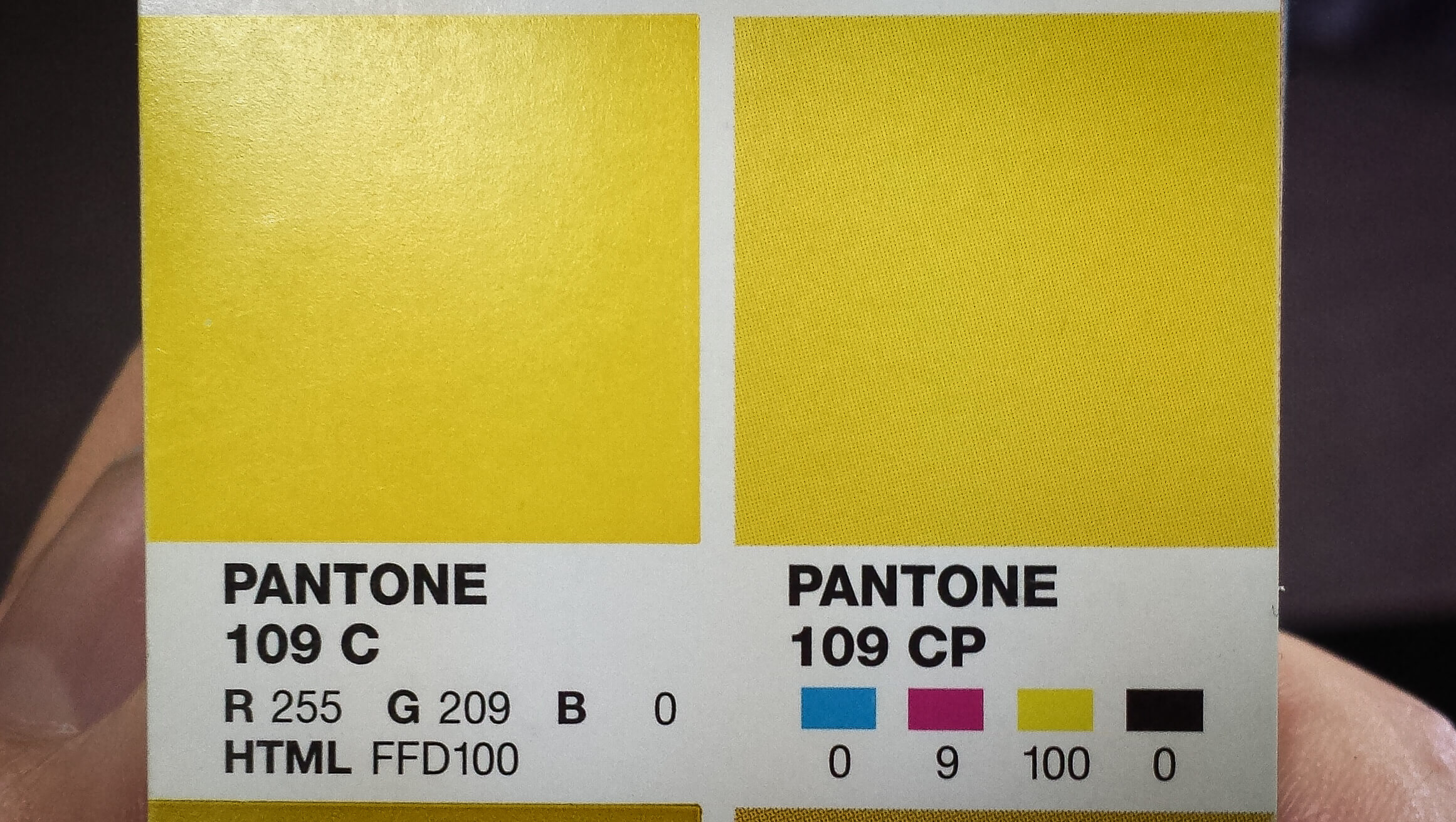
Always be sure to use the CMYK, RGB and/or HTML values recommended here on the Pantone swatch. Avoid converting by any other method.
Getting consistent color without using Pantone inks
Unless you or your client are actually shelling out the money to print spot inks, the best way to reproduce those glorious Pantone swatches as accurately as possible is to replace every spot color swatch in your document with its appropriate, Pantone-recommended CMYK swatch, found in the Pantone swatch books. (There are online resources to locate these values as well, but they may not always be 100% accurate.)
Why must you do this? Because spot color swatches in a design program aren’t meant to be printed correctly by a process printer; they’re meant to register with the printer as the proper spot color.
In other words, because the input doesn’t match the output.
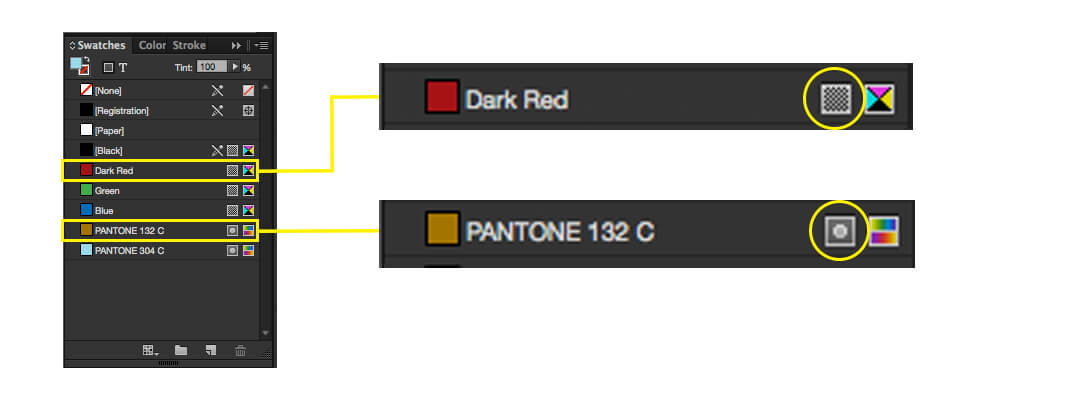
As shown in the image above, standard color swatches (such as the “Dark Red” swatch) are indicated in the InDesign swatch panel by a checkered box icon to the right of the swatch name. Spot color swatches (like Pantone swatches) are indicated with a small dot icon in the same position. If you are using any spot color swatches in your document and you are not going to be printing those with true spot color inks, you must convert those spot color swatches and all instances of those colors in your document to standard CMYK values for best results.
Here’s what happens otherwise:
If you send a document with spot colors to a process printer, the machine will check to see if it has spot color inks loaded up. When that check comes back negative, rather than just ignoring those colors in your document, it will automatically attempt to translate your spot colors into some combination of cyan, magenta, yellow and black ink.
This is where problems arise, as whatever method seems right to the computer will often not be correct to the eye. Color conversion is not like converting celsius to fahrenheit or liters to gallons; it’s not mathematical, and there is no perfect formula for converting any given color into a new color space.
Put another, less technical way: sending a document with spot colors through a standard 4-color process print is a little like translating the same sentence into a new language over and over. The end result might look passable, but it will almost certainly be missing the finer nuances of the original source material.
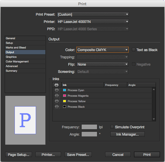
In the print popup window, select “output” on the left and see how many inks are in the ink section. If it’s more than the basic four process inks, you’ll want to convert your spot colors to process colors for optimal print results.
If you want something done right, you’ve got to do it yourself.
This is where I went wrong as a student and as a rookie professional.
So we’ve established that we need to change our spot colors to process colors before we send our document to print. But that’s easy, right? Just switch the color panel to CMYK sliders and copy whatever values are there. They should be the same values as what’s listed in the Pantone swatch book, right?
That’s what I thought, too, but I was very wrong.
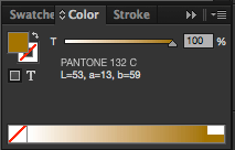
Here’s the color panel with a Pantone swatch selected.
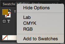
If you open the panel menu and change the color to CMYK…
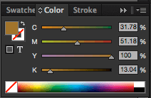
…you will not end up with the correct CMYK values for your Pantone swatch.
Changing the document color mode and/or the color mode in the color panel of a design program will NOT change a spot color to the appropriate CMYK, RGB or HTML value. You must get those from the Pantone swatch book and enter them manually. (There are easy ways to do this using the tools in the swatch panel, but I won’t go into that here.)
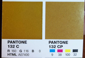
Take the example in the above image: the recommended CMYK formula for Pantone 132 C is 9/38/100/32. That’s very far from the values that InDesign dialed up for me in the color panel in the screenshot before that. (A telltale sign of improperly converted CMYK swatches is that they involve decimal points, e.g., the 13.04% black shown in the color panel screenshot above. No Pantone swatch’s recommended CMYK value ever calls for decimals.)
Coated or Uncoated?
You may have noticed every Pantone swatch has a suffix, usually either “C” or “U” (though there are others). These two initials stand for coated and uncoated, respectively, and indicate the type of paper for which the swatch is best suited.
You may have also noticed that in general, when you print something on uncoated paper—say for example cheap office copy paper, or that nifty artsy craft paper—your colors and images tend to come out darker than they do when you use a smooth or glossy stock.
That smoother paper is “coated” stock, and its smoothness allows ink to sit neatly on the surface of the paper. This helps the ink display its hue and brightness better than uncoated paper. (This is why photos are usually printed on high gloss paper.)
Uncoated stock, on the other hand, absorbs ink. No matter how white the actual paper is, things printed on uncoated stock tend to darken as the ink sinks below the surface.
So how can you ensure that the same base color printed to both stocks will still be consistent?
Compare the coated and uncoated versions of the same Pantone swatch, such as Pantone 186 C and Pantone 186 U below. (Fun fact: that’s official Husker red. Know your audience.) You’ll notice that the uncoated swatch is a bit lighter. This is because of the darkening that occurs when printing on uncoated stock. The same Pantone spot color will look a bit different on coated and on uncoated stock.

Uncoated swatches (such as the right swatch in the image above) tend to be slightly lighter than coated (left) to offset the natural darkening effect that uncoated paper has. Notice that the CMYK values are all lower.
So if, for example, your brand color is Pantone 109 (bonus factoid: that’s the yellow I’m using on this site), and you’re trying to mimic the look of the Pantone 109 spot color on coated stock, use the values from the Pantone 109 C swatch. Likewise, if you want to mimic how Pantone 109 looks when uncoated stock is the final destination, use the CMYK (or RGB/HEX) value from the Pantone 109 U swatch.
[EDIT: It’s worth noting, as I left out of the original version of this post: the actual Pantone ink formula for a coated swatch will be exactly the same as the ink formula for an uncoated swatch. The CMYK, RGB and all previews will be different between the two, because they’ll be designed to match the result of printing that specific spot color formula on the given paper type, but the actual spot colors are identical. They will, however, inevitably vary; you can’t expect to print one ink on two different kinds of paper and have them look identical. Therefore, if you’re looking for the same literal color to be printed on both coated and uncoated stocks identically, it may be best to try to manually match swatches, not rely on the same Pantone number for both applications. Thanks to Dave for mentioning this to me in the comments below!]
[Additional edit: this site has been moved off WordPress, so there are no longer comments. You live on in infamy, Dave.]
Dammit, gamut
Have a look through a Pantone swatch book and you’ll notice each individual swatch has two side-by-side samples. The left sample is printed with true Pantone ink (which, by the way, is why Pantone books are so expensive; printing hundreds of spot colors is no cheap or simple task). The right sample, meanwhile, is appended with a “P,” indicating it’s printed with process color.
You’ll see that these side-by-side samples of spot color and process color are not always an exact match, with the degree of discrepancy varying from swatch to swatch. This is mostly because CMYK has a limited gamut (color range) and simply cannot reproduce all colors with 100% accuracy, so this is not a foolproof system. Also, as mentioned earlier, spot colors print a solid layer of ink, while process printing creates color with halftone dots. Still, the values listed on these Pantone swatches are generally your best bet for at least getting as close as possible.
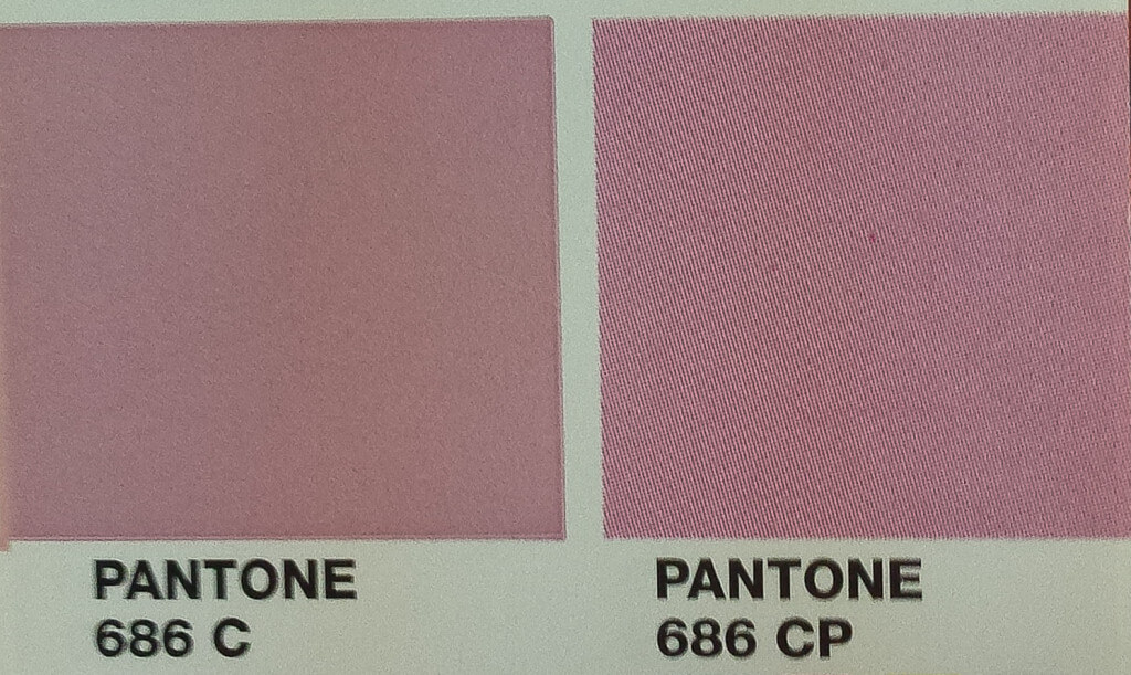
Due to the limitations of the CMYK gamut and halftone printing, some colors will be more consistent than others when translated from Pantone.
When choosing colors for a client, I often try to find Pantone swatches with as little discernible difference between the spot and process sample as possible, since most clients will rarely (if ever) be printing with a true Pantone spot color ink.
One tip worth noting: a CMYK value that has at least one ink at or near 100% will usually give you a richer and more consistent process color output than a swatch with process colors all at low or mid values.
OK, so what about RGB and HTML color?
The RGB and HTML values accompanying each Pantone swatch are the values you should use for digital media—for example, using a Pantone color in an onscreen presentation or as a color for a website.
A quick refresher on RGB vs. CMYK
RGB is the color mode of virtually every electronic display, from your phone to your computer monitor and probably your TV, and it is effectively the opposite of CMYK. In process print, the paper starts white and brightness is subtracted with colored ink until eventually you reach black; conversely, in RGB, the background of a display is black by default, and colored light is added until eventually white is created.
HTML (also called HEX) is exactly the same as RGB. They’re the same thing; HTML/HEX just uses a different method of entering the color values. (Hex is short for hexadecimal, a digital numbering system that includes 16 basic single-digit numbers rather than 10.)
RGB/HTML/HEX has a different gamut from CMYK/4-color/process, and while the two mostly overlap, there is still a narrow range of specific colors that can be printed but which cannot displayed accurately onscreen and vice versa. For example, very deep, dark colors can be an issue in RGB since by default there’s always at least a little bit of light creating and illuminating the colors your eye perceives on a backlit screen. Conversely, bright whites and neons tend to be problematic in the world of paper and ink, where adding color necessarily means darkening to a certain degree. Also, this is a good point to mention that you cannot actually print white using a standard printer, since there’s no way to mix colored inks together and create white. Anything you designate as white in your document will just be the plain paper color.
(Print and screen also have different resolutions, with print generally being much higher, but that’s another topic altogether.)
What this all means
If you want to mimic, for example, Pantone 109 C onscreen, you should input the RGB or HTML value from the Pantone 109 C swatch. What you shouldn’t do is pick a Pantone spot color swatch and then export that in a jpeg, or use the eyedropper tool or something like that. Again, this takes precise color control out of your hands and leaves it to the assumptions of a computer algorithm. Always use the values on the Pantone swatch.
Note that just because you manually set your swatch’s CMYK value to what’s on the Pantone swatch doesn’t mean the RGB is correct, too. To the contrary; as I mentioned earlier, there’s no precise way to convert colors from one color space to another, so if your color is correct in one color space, it’s wrong in the other. Calibrate for your intended purpose. And remember that to properly output RGB color, your entire document should be set to RGB color mode.
What to provide to your clients
This depends somewhat on the client and the intended use, but in general, if you and/or your client are serious about accurate and consistent color reproduction, you should be providing your client with a suite which includes every permutation of their logo dialed up in each of these color modes (and with multiple file types for each):
- Pantone Coated
- Pantone Uncoated
- CMYK with values from the coated swatch
- CMYK with values from the uncoated swatch
- RGB (I recommend the value from the coated swatch)
- White/reversed
- Black
A note about black and white
White is easy. It’s all colors at max in RGB, and all colors at zero in CMYK. Even the computer won’t mess that up. But black, on the other hand, works a little differently.
If you dial up black in RGB mode, you’ll get a slightly different black than you would if you hit the black swatch while in CMYK color mode. RGB black is 0/0/0; that’s simple. No light = black. But in CMYK, if you try to do the opposite and crank up all four process inks to 100% each, you will get a very rich black (the one called “Registration” in InDesign’s swatch panel), but you’ll also waste a ton of ink if you max out every color in your printer to create black.
I could go further into this, but for now, just know that standard CMYK black is dialed in as 0/0/0/100, and you should generally just go with that for things like black body copy. You can make your blacks darker and richer by mixing the four process colors if you so choose, but at the expense of more inks being used on every single instance of black coloring.
So does this mean that I should give my client two sets of black files?
If you want to be incredibly picky, you can. But it’s generally safe to assume that a client’s only use for a black logo is in print. There isn’t any restriction on color in onscreen media—no cheap print jobs, no costly ink, no black-and-white newspaper ads—so it’s probably ok to only make black logos using whatever CMYK black formula you settle on.
Great! I read this whole thing, so now my colors will always match perfectly, right?
Well…in a word, no.
Properly utilizing Pantone colors is your best chance at fighting color discrepancy, yes. But this should be considered more of a loose guide to a journey with many variables than any guarantee of success.
The fact is, every printer is different. You could send the same file to ten different printers and get ten slightly different results—or even use the same printer all ten times and wind up with variances.
All paper is different, too, and paper and ink are both sensitive; conditions like temperature, humidity, light, and even the mere weight of the paper can affect printing results. But even a perfect process printer in perfect conditions couldn’t replicate every single color the eye can perceive with 100% accuracy; that’s impossible. And even if it weren’t and all your print materials were perfectly matched, every screen in the world would still be different, capable of being modified to display color differently and to be brighter or dimmer than the one you’re looking at.
Put bluntly, there is no true perfection in color reproduction. You won’t achieve it. Color isn’t a precise studio recording you can play back at will; it’s an ongoing live concert. The same notes may be played on the same instruments night after night, but the production is always unique to some varying degree.
If color is extremely important to you, your only solution may be testing and tinkering over and over and over until you finally get acceptably close to the results you desire. But hopefully, now you have the tools to avoid some of the pitfalls along that journey, to get as close as you can, and to explain to clients, when necessary, how that whole process works.